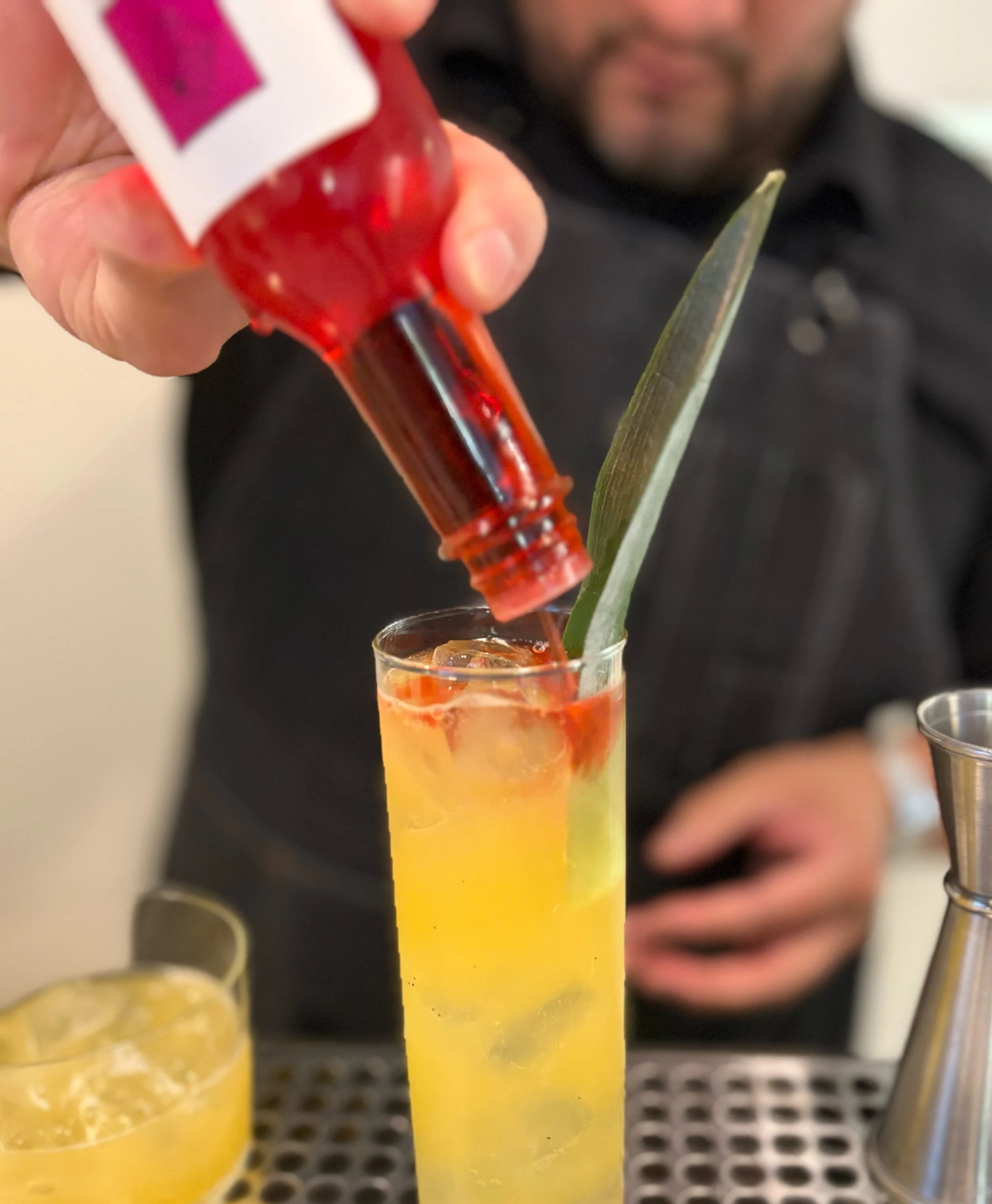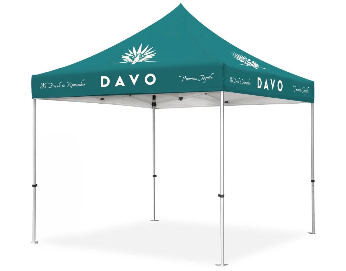

Davo Tequila's work spans style guide development, mood boards, packaging, business cards, copywriting, signage, photography, and even signature cocktail consulting.
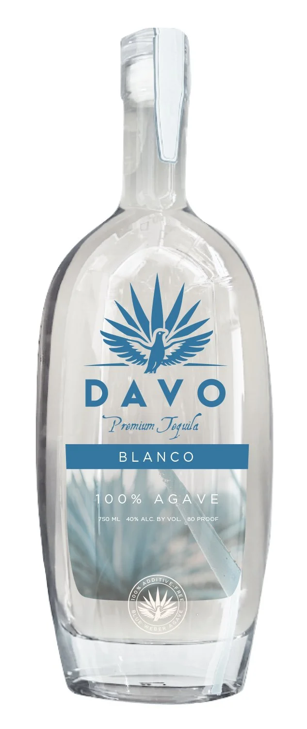
The Davo packaging demands a clean, premium aesthetic that balances deep brand storytelling with clear differentiation between expressions like Blanco and Reposado. On the back of the bottle, a blind-embossed dove complements the brand's core narrative, "We drink to remember." Additionally, tactile elements like the hang tag and custom "marks of authenticity" are intentionally deployed to communicate the spirit's exceptional quality.